Colours & Finishes
Choosing a colour is mostly about the house, not the drive. Here are the broad tones and how they tend to sit against Gloucester frontages.
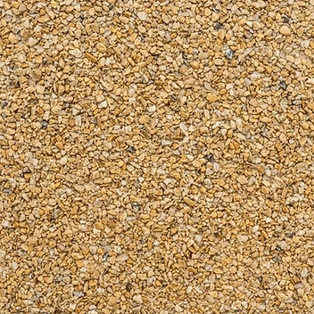
Warm and light. Sits comfortably against pale render and stone detailing.
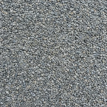
Cool and even. A quiet choice next to red brick and modern frontages.

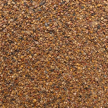
Russet and amber tones that pick up the warmth in older brickwork.

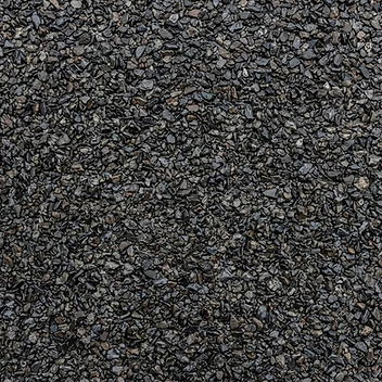
Deeper charcoal tones. Shows less in the way of everyday marking.
Colours shown are illustrative. Natural aggregate varies slightly from batch to batch, and screens do not reproduce stone colour exactly.
Other broad tones include warm stone, oyster, and steel and silver mixes. These are descriptions of natural aggregate blends rather than product names, and blends can be adjusted.
Aggregate size and texture
Finer aggregate reads as a tighter, smoother surface and feels easier underfoot. Coarser aggregate gives more texture and tends to disguise everyday marking. Both are laid the same way; it is a question of the look you want.
Choosing against your frontage
Gloucester red brick
Warm stone, buff and autumn blends pick up the tone of the brick. Silver greys give a cooler contrast that keeps the brickwork as the feature.
Pale render
Mid greys and warm stone tend to hold their own without looking washed out against a light frontage.
Darker brick
Lighter buff and oyster tones lift the frontage; dark flint can look heavy unless there is stone or render to break it up.
Stone detailing and borders
Cills, thresholds and low walls are worth matching to. A charcoal or contrasting border can tidy an awkward shape.
We would always suggest looking at samples in daylight, at the property, next to the brick or render rather than deciding from a screen. Once you have a shortlist, the maintenance page is worth a read — lighter blends show more, darker blends show less.
Not sure which finish suits the house?
Tell us a little about the property and we can bring suitable samples when we come to measure up.